SaaS Teardown #01: Is Notion’s Infinite Flexibility a Fintech Nightmare or a Blueprint?
SaaS UX Teardown
Beyond the Canvas: How Notion uses Onboarding, IA, and Behavioral Psychology to weaponize "Modular Clarity.”
In the UX world, we’ve spent a decade obsessing over 'minimalism,' but we often confuse it with functional poverty. Users don’t actually want fewer features; they want agency.
Notion’s explosive growth wasn't fueled by being a 'simple' note-taker—it was fueled by giving users the 'LEGO blocks' to build their own operating systems. It’s a masterclass in Modular Clarity. But as a designer who spends most of my time in the high-stakes, data-dense worlds of Fintech and Web3, I see a dangerous tension here.
There is a razor-thin line between a 'flexible workspace' and an 'unnavigable silo' that collapses under its own weight. Today, I’m tearing down Notion’s UX to ask the $100 billion question: Could this modular architecture be the blueprint that finally saves the cluttered, rigid world of digital banking—or is it a UX nightmare waiting to happen at scale?
1. The Strategy of Modular Clarity: Atoms over Layouts
In the high-stakes world of digital banking, we often bury users under a mountain of rigid tables and fixed data points. The result? A "frozen" user experience that feels more like a spreadsheet than a tool. Notion’s first "secret weapon" is Modular Clarity—a systematic approach that solves information density by atomizing data.
Instead of a static page, every row, video, or database is a "moveable atom." This isn't just a UI trick; it shifts the user’s mental model from being a passive reader to an active architect. By giving people the agency to rearrange these atoms, Notion provides a level of ownership that most Fintech dashboards desperately lack.
The Power of "Hidden" Complexity
This block-based interface is the engine behind Notion’s Progressive Disclosure. Because the workspace isn't locked into a traditional top-to-bottom scroll, the UI stays remarkably clean despite the power under the hood.
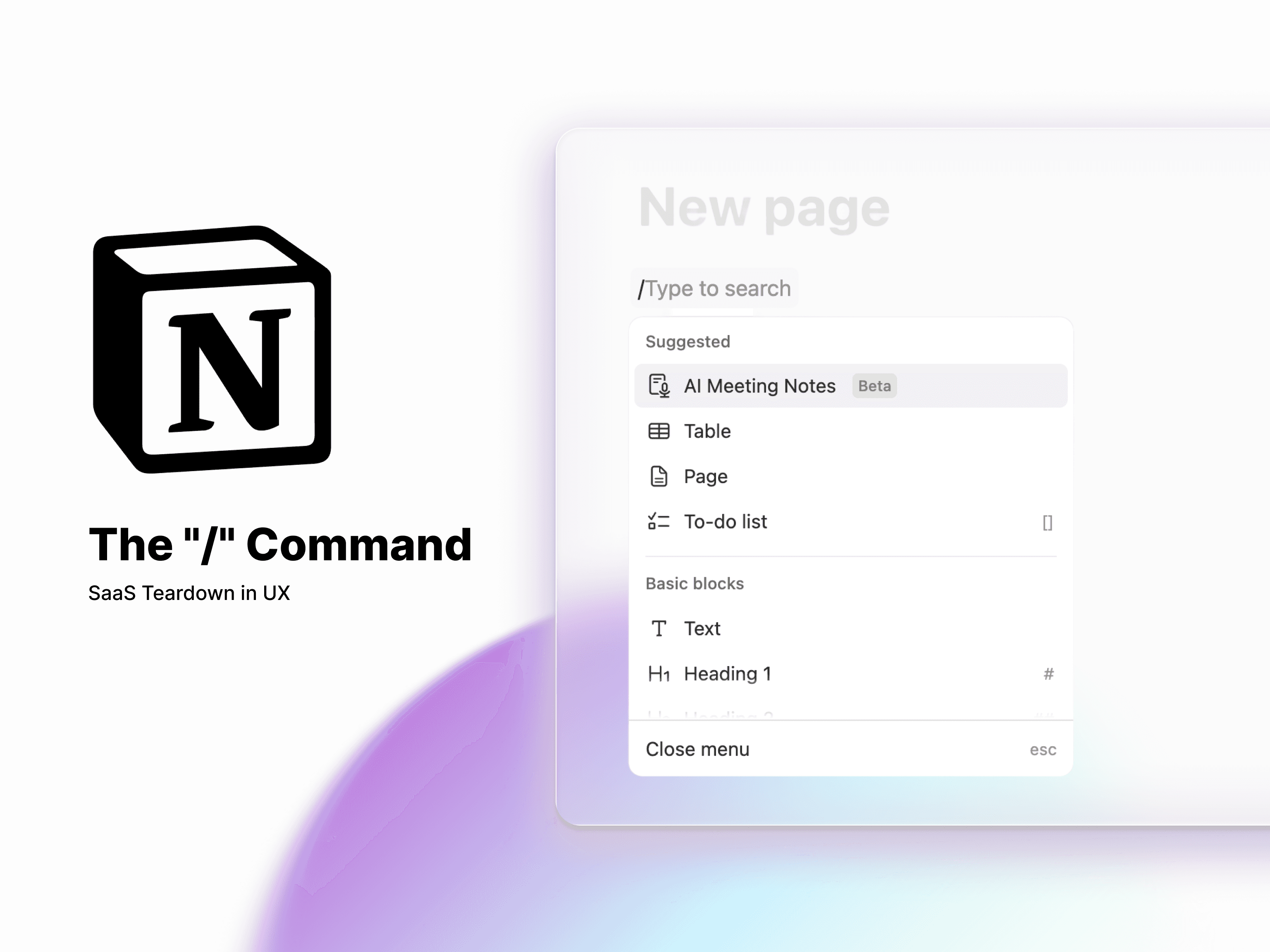
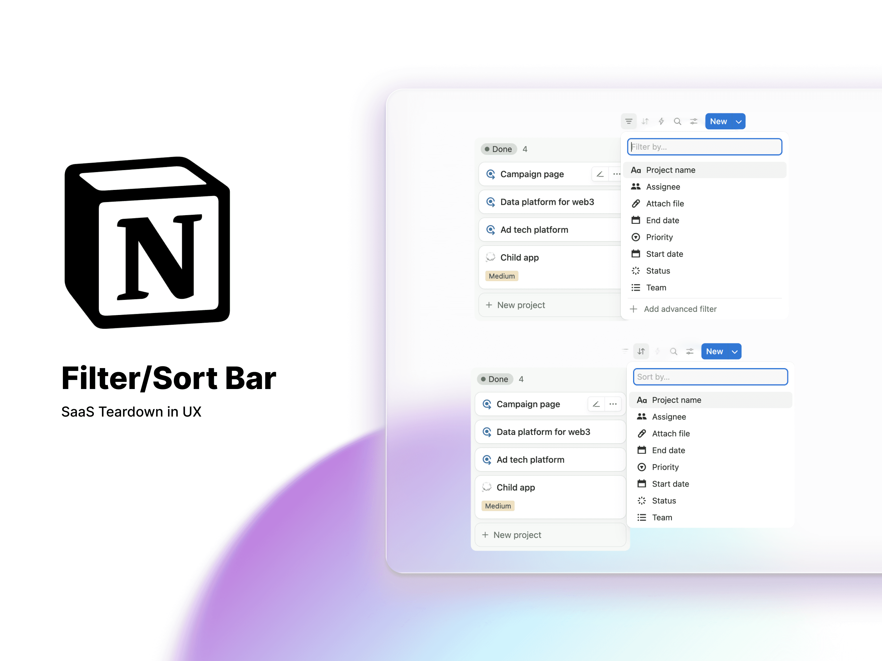
The "/" Command: This is "Complexity on Demand" at its finest. By tucking power-tools like Relational Databases and LaTeX embeds behind a single keystroke, Notion maintains a high Signal-to-Noise ratio. The user is never intimidated by tools they aren't ready to use yet.
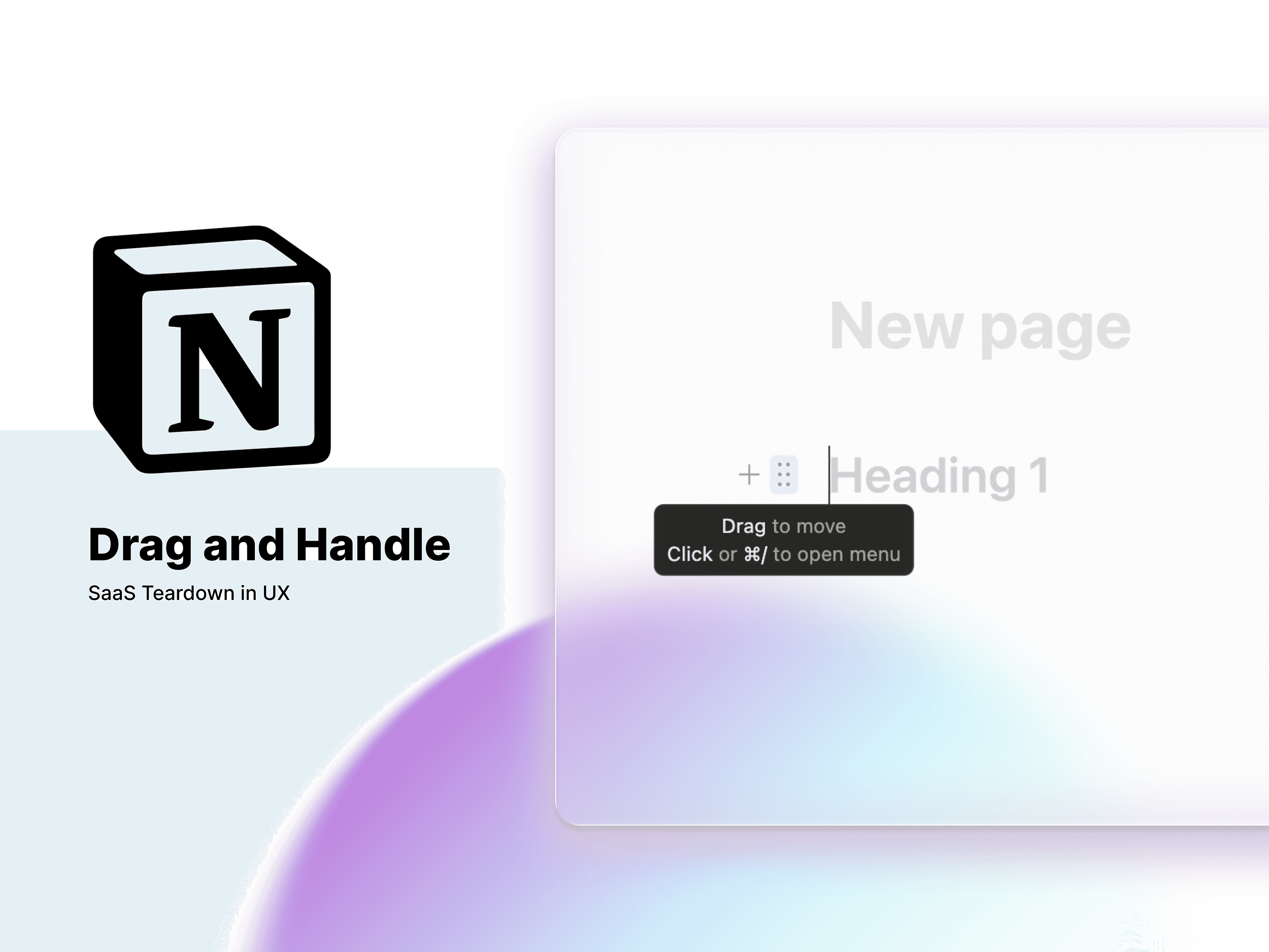
Direct Manipulation: The simple drag-and-handle icon transforms the experience. You aren't just "editing a document"; you’re operating a Workspace Builder. That sense of tactile control is what turns a software tool into a personal operating system.
The Fintech Parallel: Building the "Alpha-Terminal"
Imagine the opportunity here for Web3 or high-frequency trading platforms. Traditionally, these dashboards are intimidating walls of data that require a week of training to understand.
But what if we applied Notion’s "Block Logic"? Imagine a Trading Command Center where every price chart, order book, and news ticker is a movable module. A trader could build their own bespoke "Alpha-terminal" in seconds, dragging the most critical data to the center and collapsing secondary metrics into toggles. Notion proves that even the most complex financial data can feel lightweight—if we give the user the right building blocks to manage it.
2. The Headstart Effect: Killing the "Blank Page" Anxiety
We’ve all been there: you open a powerful new tool, stare at a blinking cursor on a blindingly white screen, and immediately close the tab. This "Blank Canvas Syndrome" is the silent killer of user retention. When a product is as flexible as Notion, the sheer number of possibilities can actually paralyze a new user.
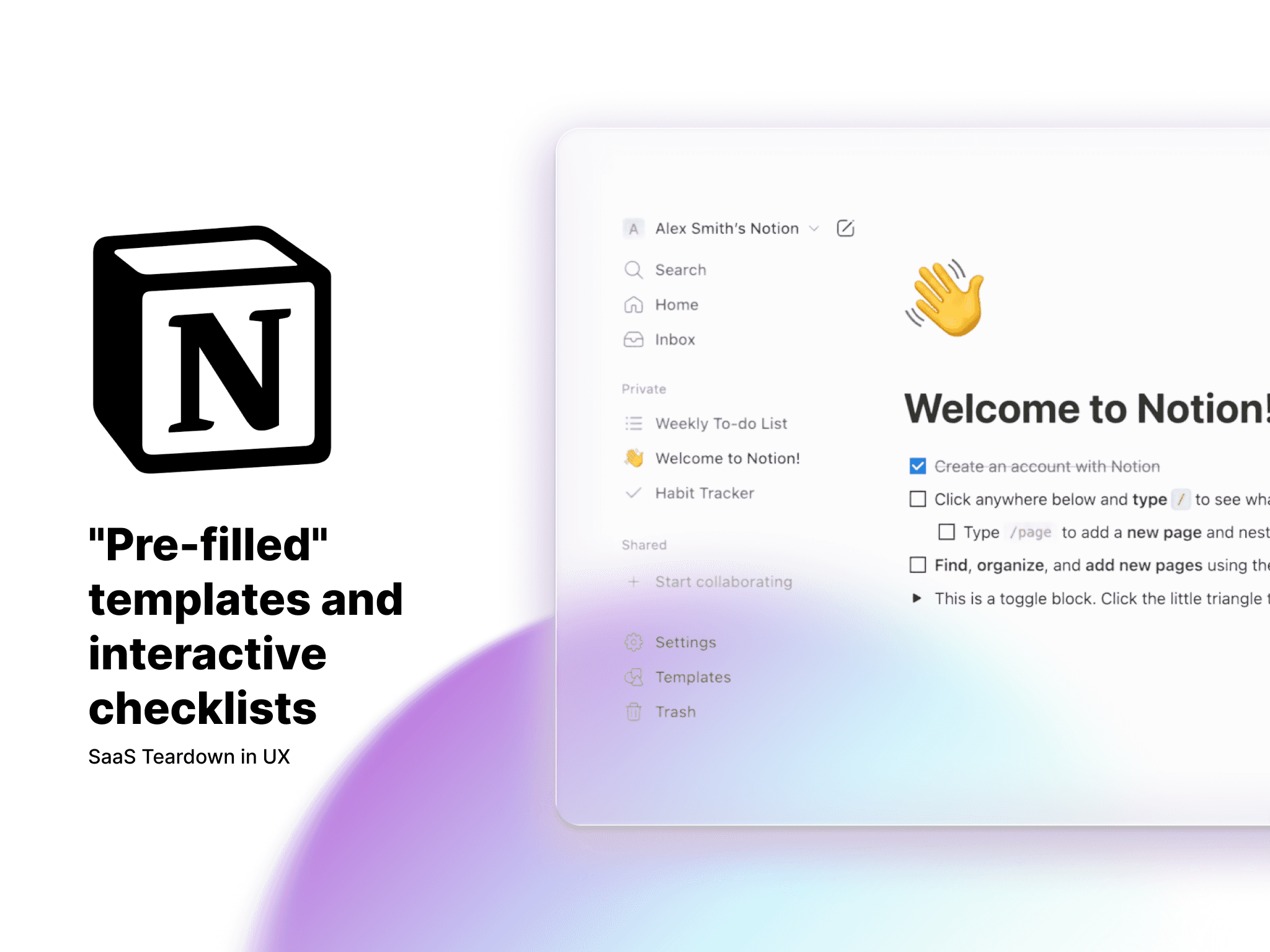
To fight this, Notion uses what I call the "Headstart Effect." Instead of forcing you to build your own world, they leverage the Endowed Progress Effect—a psychological nudge where people are more likely to complete a task if they feel they’ve already started it.
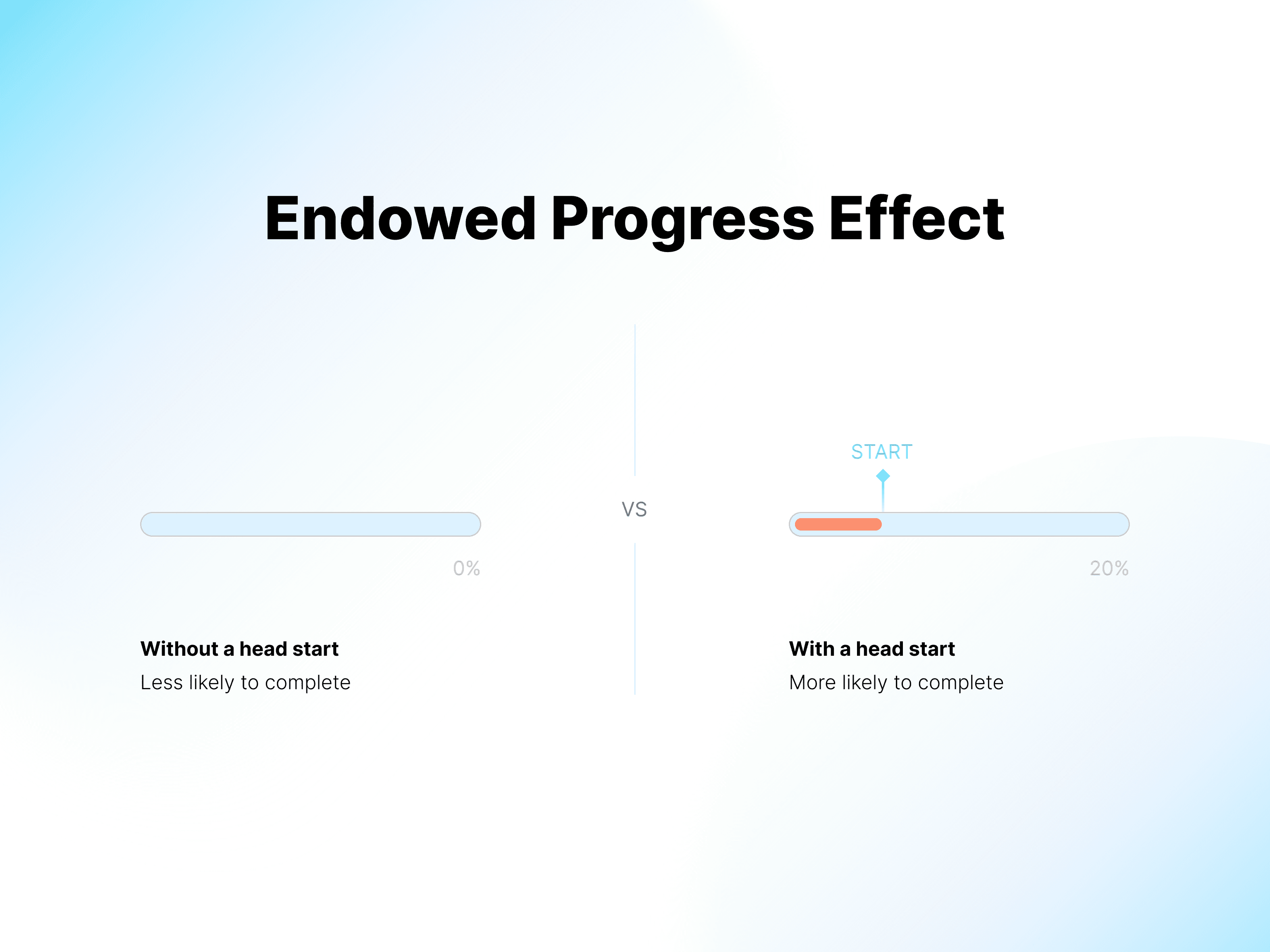
By providing "pre-filled" templates and onboarding checklists that are already 30% complete, Notion shifts your mindset from creating to finishing. It’s a brilliant bit of UX jujutsu: they lower the "cost of entry" by giving you a series of small, satisfying wins. Before you know it, you’ve stopped "setting up an app" and started building your "Single Source of Truth."
The Fintech Parallel: The "Jobs-to-be-Done" Dashboard
Most banking apps are remarkably rigid—everyone gets the same generic list of transactions regardless of their financial goals. But imagine if we applied the Headstart Effect to a Wealth Management or Neo-banking app.
Instead of a standardized homepage, the app could ask, "What are we doing today?" and offer pre-configured modules:
The "Saver" Layout: High-visibility progress bars for emergency funds.
The "Investor" Layout: Real-time tickers and portfolio heatmaps front and center.
The "Spender" Layout: Daily budget tracking and categorizations.
By giving the user a "headstart" with a dashboard tailored to their specific financial behavior, we switch the product from a static utility into a personalized tool. It’s the difference between showing someone a ledger and giving them a roadmap to their own money.
3. Complexity on Demand: The "Invisible" Information Architecture
Perhaps the most impressive feat of Notion’s IA is its ability to stay out of its own way. We’ve all seen "pro" tools that look like an airplane cockpit—intimidating, cluttered, and impossible to navigate without a manual. Notion takes the opposite approach: Complexity on Demand.
By leaning heavily on Progressive Disclosure, Notion maintains an incredibly high signal-to-noise ratio. To a first-time user, it looks like a humble notepad. The "heavy machinery"—relational databases, linked views, and API embeds—remains completely invisible until the exact moment you call for them (usually via the / command). This "Just-in-Time" UI ensures the platform is deep enough for an enterprise engineering team while remaining approachable for someone just jotting down a grocery list.
Designing for "Multimodal" Mental Models
What makes this IA truly "Senior" is how it handles different ways of thinking. A Product Designer might see a roadmap as a Kanban Board, while a Finance Manager sees that exact same data as a Line-Item Table. Notion doesn't force a choice; it provides multiple "views" of the same data source.
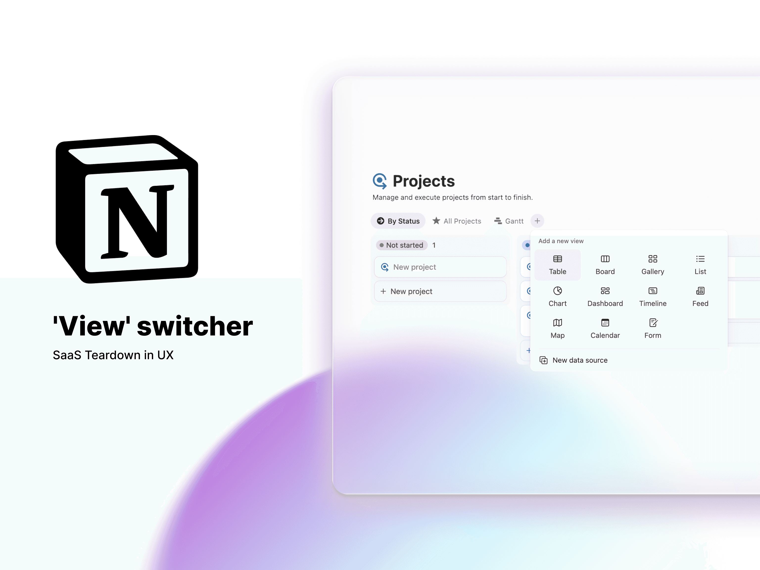
This is more than just a feature; it’s Data Democratization. By making complex, SQL-like filtering accessible through a simple UI, Notion has effectively turned non-technical business users into Database Managers without them even realizing it. It’s a masterclass in balancing a massive feature set with a distraction-free user experience.
The Fintech Parallel: The "Context-Aware" Audit Trail
In high-complexity Fintech—think loan processing, mortgage underwriting, or crypto compliance—we often force users to jump between five different tabs to verify a single transaction. It’s a cognitive nightmare.
If we applied Notion’s Multimodal IA to a Fintech Audit Trail, we could solve this. Imagine a "Context-Aware" workspace for an auditor:
・The "Reading" View: A clean, document-style layout for reviewing a borrower's narrative.
・The "Verify" View: A high-density audit table that automatically surfaces linked bank statements and credit scores next to the text.
By allowing users to toggle their "Mental Model" without losing their place, we reduce the risk of human error and significantly speed up the decision-making process. Notion proves that you don't need to simplify the data—you just need to simplify the access to it.
The Verdict: Modular Agency is the Future of Product
Notion’s success isn't an accident of aesthetics; it’s a masterclass in User Agency. By treating Information Architecture as a set of LEGO blocks rather than a pre-poured concrete foundation, they’ve solved one of the hardest problems in software: Scalability versus Simplicity.
For those of us building in "high-friction" industries like Fintech or Web3, the lessons are clear. We don't need to strip away features to make our products "simple." Instead, we need to:
Atomize our data to give users control over their own mental models.
Manufacture momentum by killing the "Blank Page" anxiety through strategic onboarding.
Hide the machinery until the exact moment it’s needed, ensuring power never comes at the cost of clarity.
Whether you're building a crypto wallet or a global knowledge base, the goal remains the same: Design a tool that feels like an extension of the user's mind, not a barrier to their work.
What I’d read next:
Notion’s flexibility is a double-edged sword for Fintech. As complexity grows, so does the need for rigid systems. See how I’m using these same principles to stay ahead of the curve in Why Design Systems Are Your Ultimate Career Moat.