SaaS Teardown #02: The Architecture of Certainty—How Wise Designs Trust in Financial Complexity
Saas UX Teardown

Sending $5,000 USD across the world shouldn't feel like a gamble, yet most traditional banking UIs make it feel exactly like that—a leap of faith into a black hole of hidden fees and "processing" delays.
Wise changed the game by shifting from compliance-first design to confidence-first architecture. They understood a fundamental truth: in FinTech, your competitive moat isn't just a lower fee; it's the psychological management of the "void."
In this teardown, we’re diving into the Information Hierarchy and systemic logic Wise uses to bridge the gap between complex global banking backends and a user who just wants to know: "Is my money safe?"
The Logic of Transparency (The Calculator)
In traditional banking, fees are often hidden behind "convenient" exchange rates. Wise’s design system flips this by leading with the most complex part of the journey: the math.
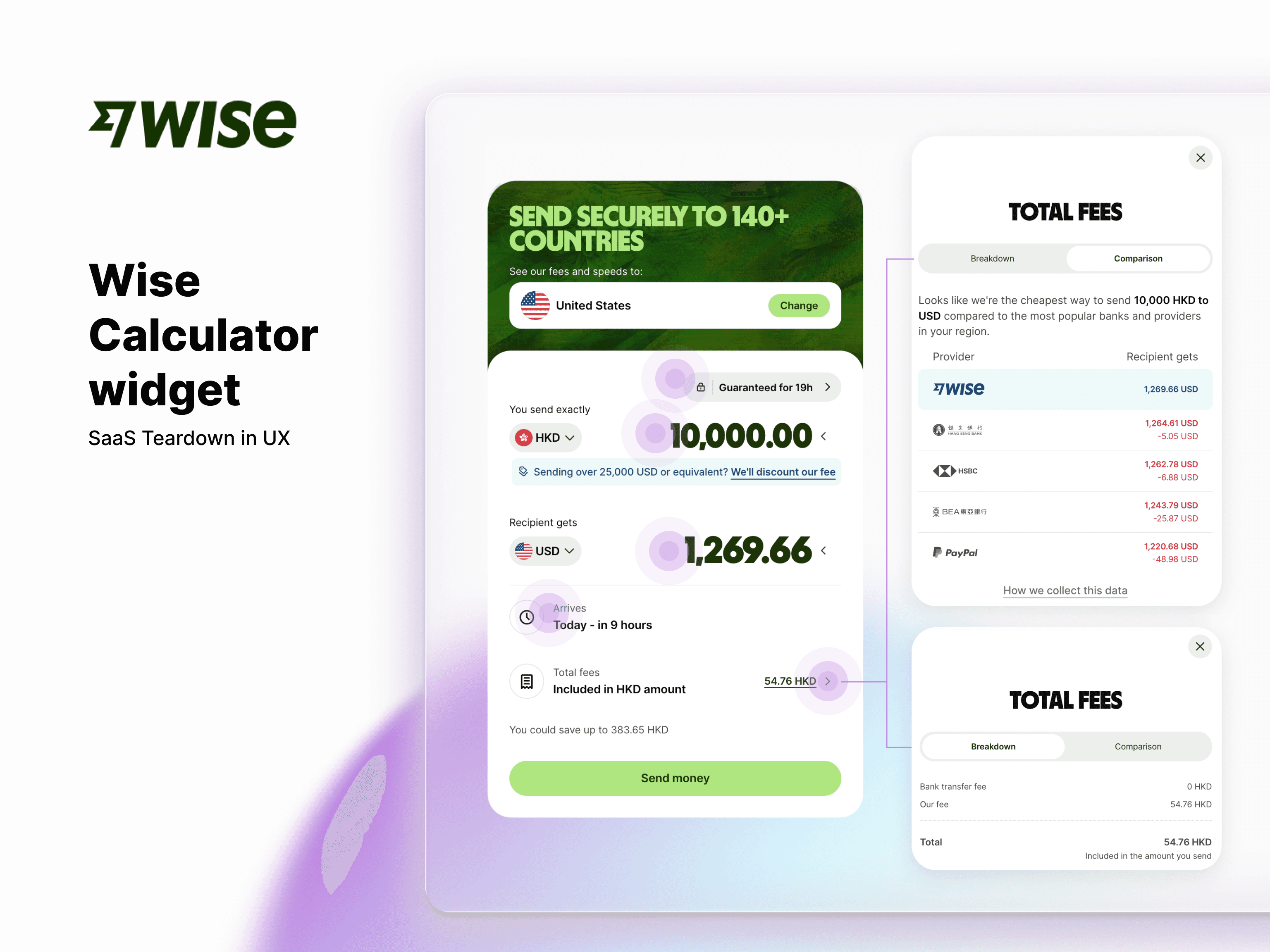
Wise calculator widget UX teardown -
"Guaranteed for 19h" Badge: Systemic mitigation of market volatility. By locking the exchange rate, the UI provides a Psychological Anchor, transforming a high-risk financial variable into a stress-free constant.
"Amount Sent" input: "Primary Input (Required)"You'll get" amount: "Primary Job to be Done: Seeking Certainty (Highlighted with highest contrast)."
"Should arrive" time: "Micro-copy as Emotional Guardrail (The Promise)."
Exchange rate and 'Our Fee' breakdown: "Strategic Transparency: Leading with complex logic to build immediate trust."
Information Architecture as a Truth Serum: Most UIs hide the "Send" button at the bottom of a long form. Wise places the Real-time Transfer Calculator front and center. By exposing the mid-market rate, the Wise fee, and the exact amount the recipient gets before the user even logs in, the system uses transparency as an aesthetic.
The Architect’s View: Notice the Visual Hierarchy. The "Amount Received" and "Arrival Time" are styled with the highest contrast. Wise understands that in a high-complexity financial transaction, the user's primary "job to be done" is seeking certainty. The design system prioritizes the result of the math over the input of the data.
The Emotional Guardrails (Status & Feedback Loops)
Once the "Send" button is clicked, the human brain enters a state of high cortisol—especially when five figures are "in flight." This is where the interface must transition from a calculator into an emotional anchor.
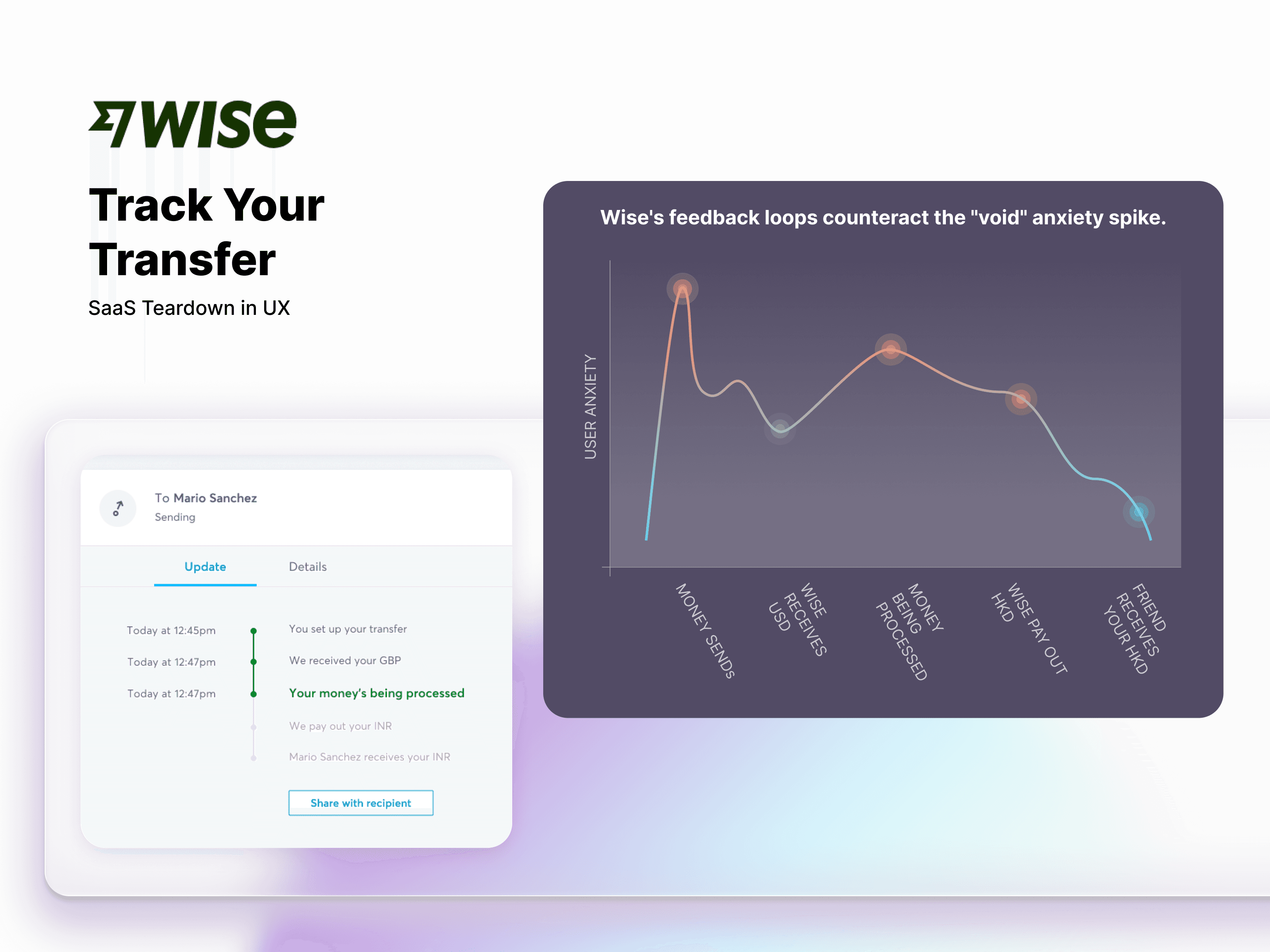
Progressive Disclosure of Technical Messiness: A cross-border transfer involves SWIFT codes, intermediary banks, and compliance checks. Wise’s design system filters this "noise" into four or five human-readable milestones. They don't show you the code; they show you the status.
The "Certainty" Pattern: Their "Track Your Transfer" screen is a masterclass in Feedback UX. By providing a "guaranteed arrival time," they aren't just giving a technical estimate; they are providing a psychological promise.
The Architect’s View: This is where "Soft Logic" meets "Systemic Design." A designer must architect the micro-copy and timing that reassures a human that their money hasn't vanished into the ether.
The "Silent Void" (A Contrast with Web3)
To truly understand the value of Wise’s certainty, we have to look at the alternative: the Silent Void of Web3.
I recently experienced a 20-day "pending" nightmare while transferring ETH from an Exodus wallet. The experience was the polar opposite of certainty. There was no estimation. No internal feedback. I had to rely on third-party block explorers just to see if my transaction was even in a queue.
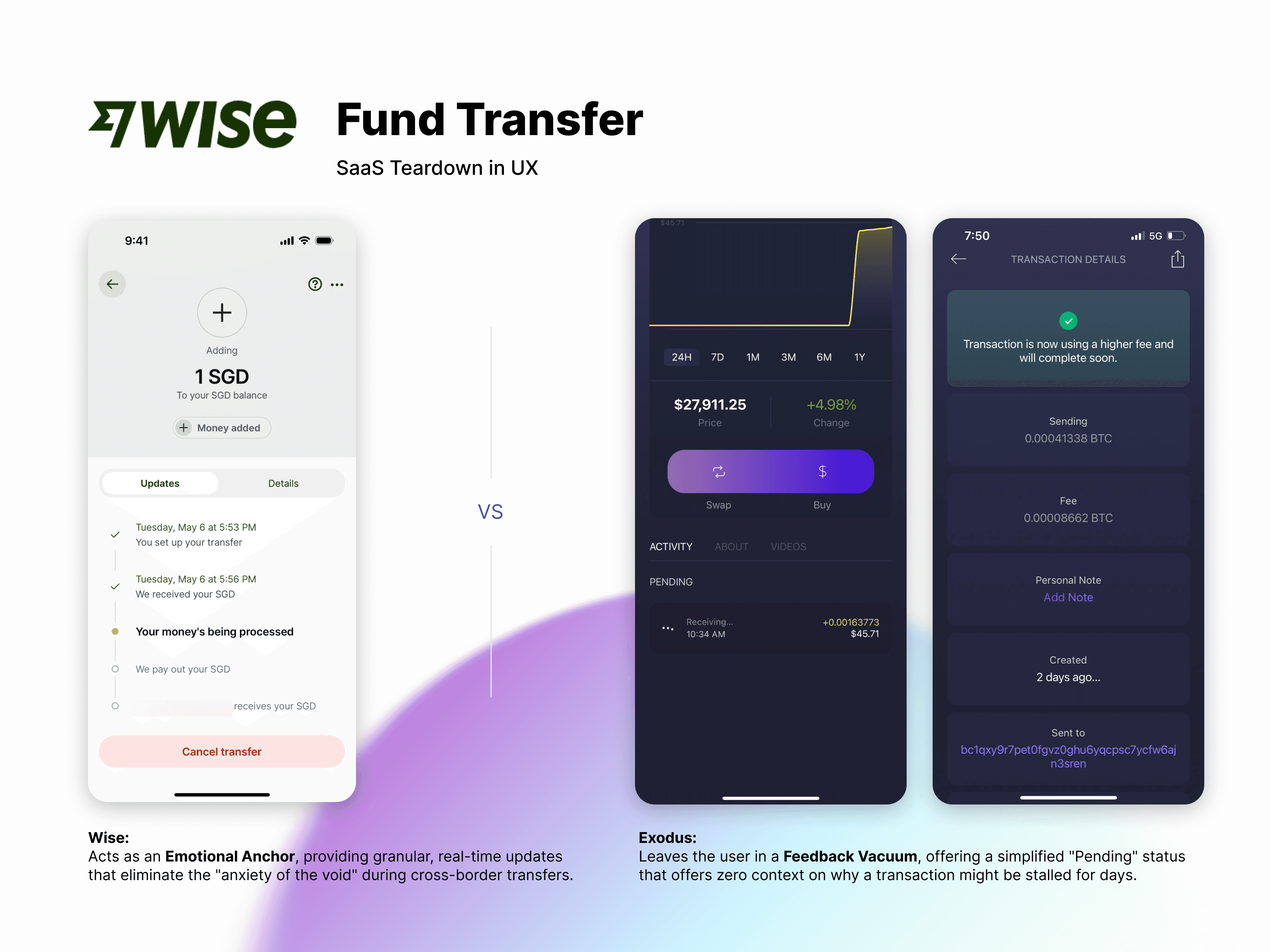
The UX Gap: In Web3, once you hit "send," the transaction floats in a Mempool (a digital waiting room). If the network is congested or gas fees spike, your transaction sits there.
The Failure: Exodus remained silent. It didn't alert me that my gas fee was too low for current traffic. It didn't update the status from "Pending" to "Stuck."
The Result: Out of pure anxiety, I re-instructed the transfer multiple times, essentially shouting into a void that wasn't listening.
The Wise Difference: Wise understands that "Network Congestion" is a technical reality that must be translated into Human Context. While Exodus left me guessing for 16 days, Wise’s system is architected to update its Estimation Logic the moment a delay is detected.
The Architect’s Insight: A design system that only accounts for the 'Happy Path' isn't a system—it’s a mockup. True seniority is defined by how you architect for the 'Friction Path.'"
Conclusion: Why Logic is the Best Aesthetic
Wise proves that "good design" isn't about the prettiest illustration—it’s about the most dependable system.
By architecting a "source of truth" that leads with transparency and anchors itself in human empathy, Wise has built a moat that traditional banks and silent crypto-wallets struggle to cross. They didn't just build an app; they built an Architecture of Certainty.
The Architect’s Insight: A design system that only accounts for the "Happy Path" isn't a system—it’s a mockup. True seniority is defined by how you architect for the "Friction Path."